The Cologne design duo Kaschkasch — Florian Kallus and Sebastian Schneider — has established itself over recent years as one of the most precise voices in European furniture design. Their work for HAY, Rolf Benz, Ton, and Living Divani shares a single quality: it looks self-evident. As though the form was never a decision, but had always simply been that way.
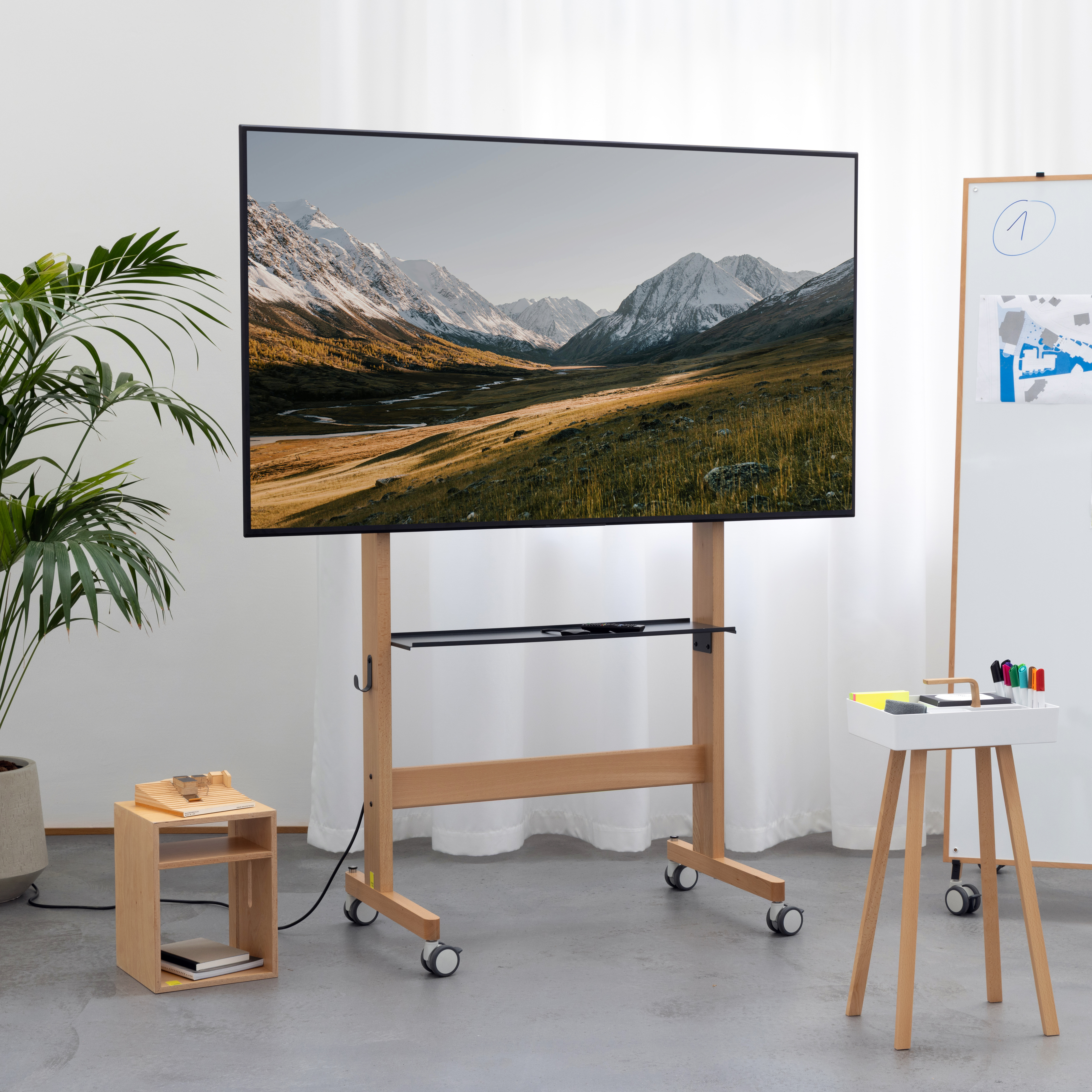
Now, for the first time, they have worked with Studiotools. The result is the Media Cart — a mobile stand for screens from 55 to over 100 inches, crafted from solid beech wood, with a back panel in anthracite acoustic felt. And with a logic behind it that elevates the object far beyond a TV stand: with the Conference Kit, the Media Cart becomes a complete all-in-one system — for the screen, video conferencing technology, up to eight Studioboards, two Cubes, and a Toolbox. 32 square metres of whiteboard surface, within arm's reach, in a single object.
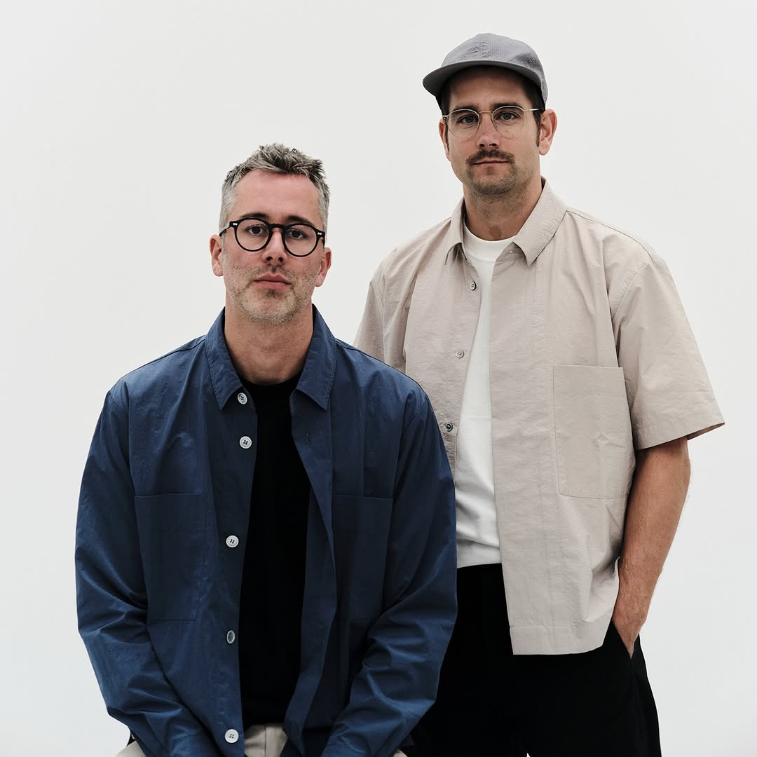
We spoke with Florian and Sebastian in Cologne — about wood in the office, the dignity of the back panel, and the art of giving a technical piece of furniture emotional weight.
What was your first reaction when you saw the brief?
Florian: That it was an unusually honest brief. Not "make us something beautiful for the conference room" — but a very clear picture of how teams work, what they need, and what hasn't been working so far. That immediately put us into a different mode of thinking.
Sebastian: And it was a good fit. The way Studiotools thinks about spaces — about flexibility, about what an object in a room enables or prevents — that's a language we know. We always start with the user, not the form. Here, the user was described very concretely.
How did you approach the object?
Florian: Through a question that engaged us immediately: how do you make a technical, pragmatic piece of furniture — a TV stand, at its core — emotionally compelling? Not decorative. Not overloaded. But in a way that makes you want it. That gives it a quality in the room that goes beyond pure function and actually stirs something.
Sebastian: Objects that merely function can be manufactured. Objects that stir something — a sense of wellbeing, of trust, the feeling that someone thought this through — that's the real design challenge. With a sofa, everyone expects it. With a display stand, almost no one does. That's what drew us in.
Wood is a very unusual choice for a product in this segment.
Sebastian: That's exactly what interested us. The market for TV stands and display furniture is overwhelmingly metal, plastic, sometimes aluminium. All very technical, very cold. Very "IT infrastructure." Wood does something different. It brings a residential warmth into the office — a warmth that doesn't feel forced, because it lives in the material itself rather than being applied as colour or texture.
Florian: Beech wood of this quality has a presence that metal simply doesn't. It ages differently. It feels different to the touch. That changes how you interact with the object — and how you feel in the room where it stands. And it fits the Studiotools world. The wood of the Media Cart is the same wood you know from other Studiotools products. That's no coincidence — it's what makes a room feel coherent without making it formally uniform.
You used radii and rounded edges. In an object this clear and reduced, that's a deliberate choice.
Sebastian: Very deliberate. Strong geometry and straight lines have power. But they can also produce a certain severity that quickly reads as cold in an office context. The radii take the edge off that. They bring a softness to the object — not in the sense of yielding or indecisive, but inviting. You don't question the object. It's simply there, and it's right.
That's also something that defines the Studiotools world as a whole — this combination of clear geometry and details that make the object more human, more approachable. The Media Cart continues that and at the same time advances Studiotools' design language further.
What was the hardest design challenge?
Florian: Reduction. We wanted an object that feels very uncluttered — where the technology is cleverly concealed, where nothing visible is there that doesn't need to be. At the same time, it's an object that carries large screens, has to route cables, optionally accommodates an installation grid for video conferencing technology, and includes a shelf. That's a lot of complexity that has to go somewhere — without ever being seen.
Sebastian: The shelf is a good example. It's sheet metal — intentionally. Against the wood, it reads as light, almost floating. The wood carries the warmth, the metal carries the lightness. Together, they create something greater than the sum of its parts. The shelf doesn't assert itself. It's elegant precisely because it steps back.
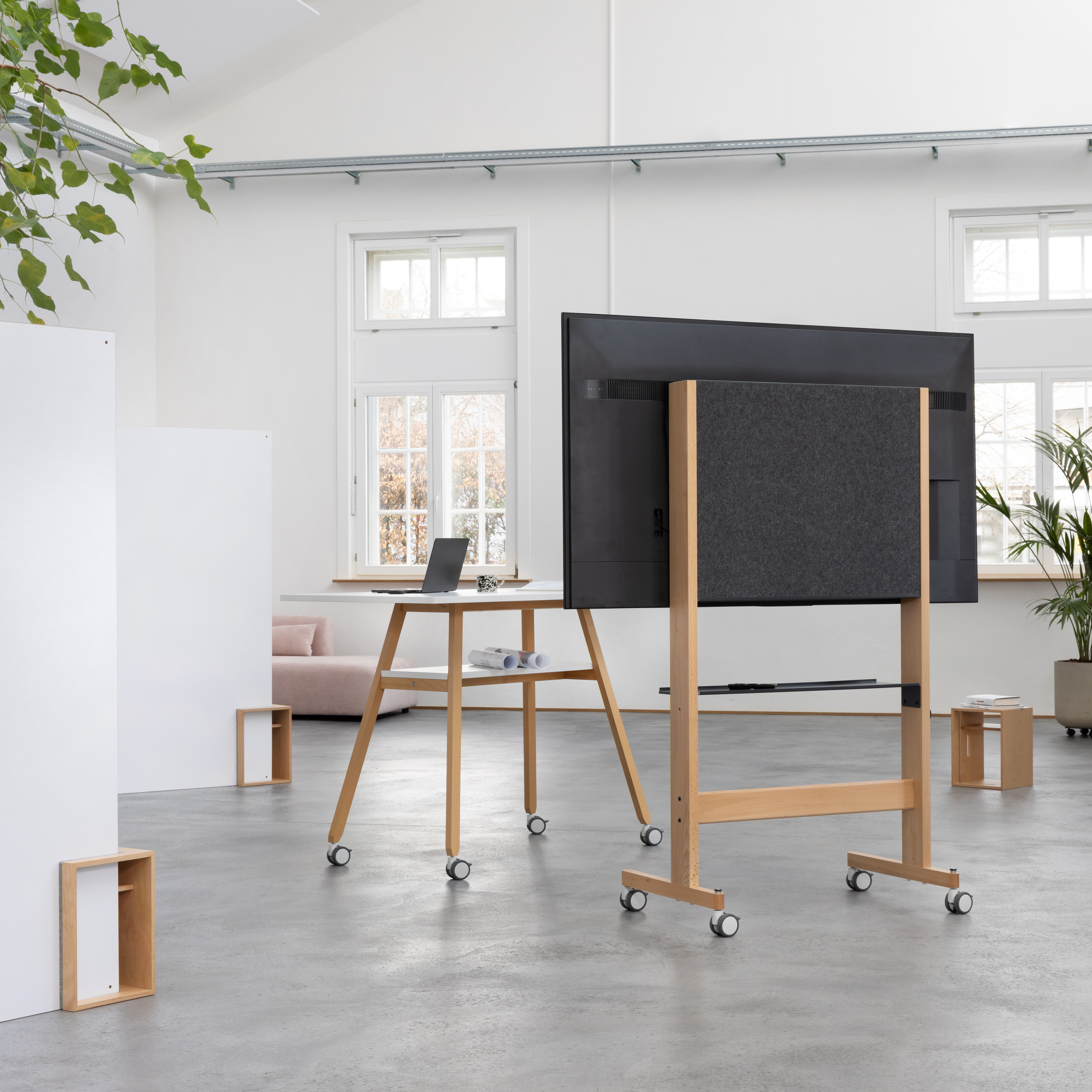
And the back panel. You raised that very early on.
Florian: Because it's the central problem everyone ignores. The moment a screen isn't wall-mounted — in an open-plan space, a hybrid meeting room, a studio — you see it from behind just as often as from the front. Half the people in the room are always looking at the wrong side. Cable chaos, metal struts, screw heads. That's not a side issue. That is the issue.
Sebastian: We decided very early on: the back is designed. The anthracite acoustic felt isn't intended as cladding — it's a surface in its own right. Calm, material, pleasant. And it happens to absorb sound, which in rooms with many hard surfaces is anything but trivial. The back panel can hold its own in a room. It doesn't have to apologise for itself.
An object that carries screens from 55 to over 100 inches. That sounds like a purely technical problem — but you took it very seriously.
Sebastian: Because it isn't a purely technical problem. A 55-inch screen and a 100-inch screen are not just different sizes. They have different weights, different centres of gravity — and different VESA mounting configurations. Some manufacturers, Sony for example, place the VESA mount at the bottom of the screen. With others, it's centred. That sounds like a detail. It changes everything: the mounting height, the leverage, the perceived and actual stability.
Florian: We wanted a single object that covers all of that — without it being visible. The mounting height must be adjustable depending on the screen and VESA position. And throughout, the proportions always have to be right. A small screen on too large a stand looks like a child in an oversized coat. A large screen on too narrow a stand looks unstable, even if it technically isn't. Neither is acceptable.
Sebastian: And then there's mobility. The object should move effortlessly — even with a 100-inch screen on it. That sounds obvious. It isn't. The centre of gravity, the spacing between the castors — all of it together determines whether an object feels controlled or wobbly when you move it. We spent a long time on that before it felt right.
Florian: What mattered most to us: it should never look "solved." When you see the Media Cart with a large screen, it should look like exactly the right proportion. As if no other possibility had ever existed. That's the real work behind the calm of the object.
Let's talk about the Conference Kit logic. That's much more than a display stand.
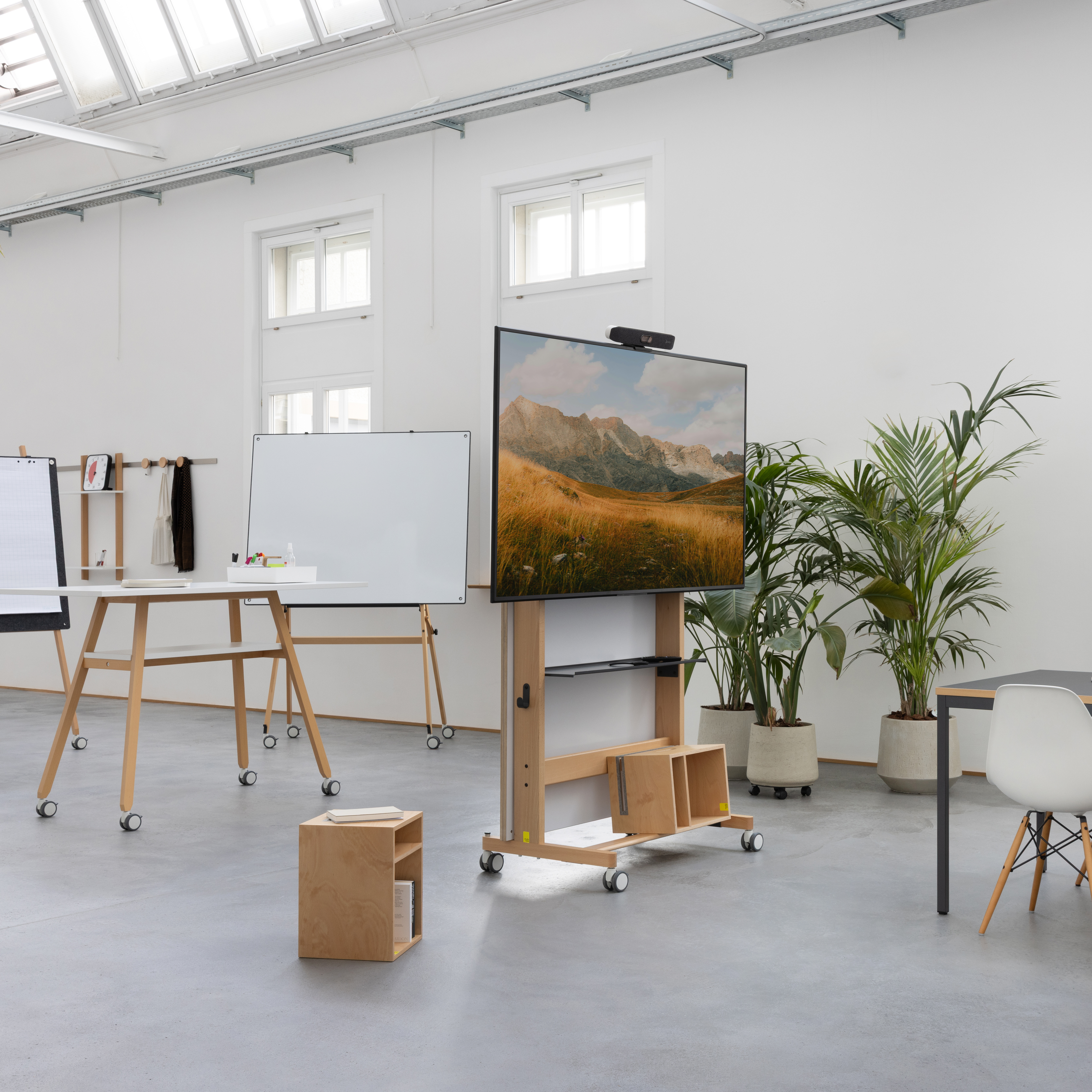
Sebastian: Much more. And that was one of the most exciting discoveries in the process. The Media Cart is the carrier system — screen, camera, technology. But with the Conference Kit, it becomes a complete visual working environment. Up to eight Studioboards, two Cubes, a Toolbox. 32 square metres of whiteboard surface, all in a single compact object.
Florian: What occupied us most was the question: how do you present all of that without it looking like an overloaded storage unit? The answer was: don't hide it at all. That's the crucial point. Everything stays visible, everything stays within reach. The boards lean against it, the Toolbox hangs, the Cubes stand. You can see what's there and use it immediately.
Sebastian: That's not a design decision in the narrow sense — it's applied work psychology. What you have to search for, you use less often. What's simply there, you use. The Conference Kit is built so that reaching for a board is as natural as reaching for a pen. No friction. No moment of hesitation.
When the boards are fully in use, the spatial effect changes completely.
Florian: That was one of the most surprising discoveries. Beyond a certain setup, the perception tips. The Media Cart stops being a piece of furniture — and becomes a room divider. Suddenly there's organic spatial zoning without any planning. For open-plan office concepts, that's enormously interesting. You can structure a room in minutes and open it back up in minutes.
Sebastian: A room divider that is simultaneously a presentation surface, a writing surface, and a technology carrier — that changes how a team works in that space. It's no longer a piece of furniture. It's a mobile spatial structure.
Kaschkasch usually works with residential furniture manufacturers. What was new about this assignment?
Florian: The user context is different. In a home, an object is allowed to be introverted — it can take time before you understand it. In a meeting room, it has to be immediately clear what the object does. At the same time, the brief was: it shouldn't look like an office product. It should look like a very good object that happens to be in an office. That's a narrow line to walk — but it's exactly where we're comfortable.
Sebastian: What surprised us was how much of what we know from other fields applied directly here. Thinking about material warmth, about proportions, about details that make an object more approachable — it's the same work. Just a different context.
What do you take away from this collaboration?
Sebastian: The vocabulary. The way Studiotools thinks about spaces and behaviour gave us language for something we had always been doing intuitively. That objects shouldn't just function, but should enable or prevent behaviour. That sounds simple. It isn't.
Florian: And an appetite for more. With the Media Cart we worked on one problem — the screen in the room, the technology that has to be integrated, the stand that doesn't want to be a stand. There are many other problems in this space. They interest us now. We're not done yet.